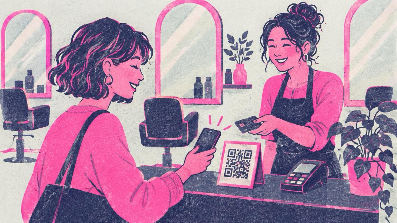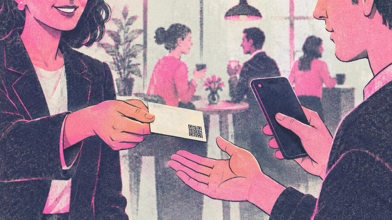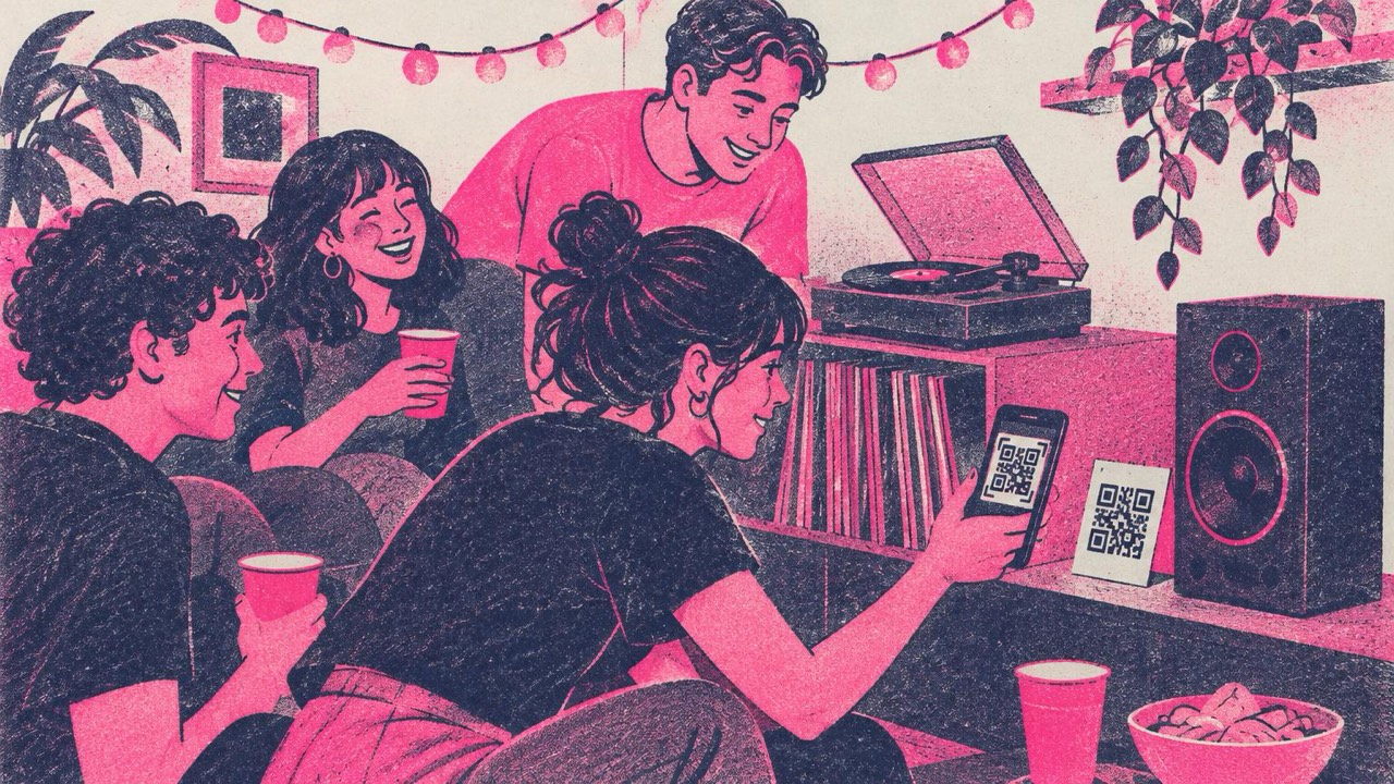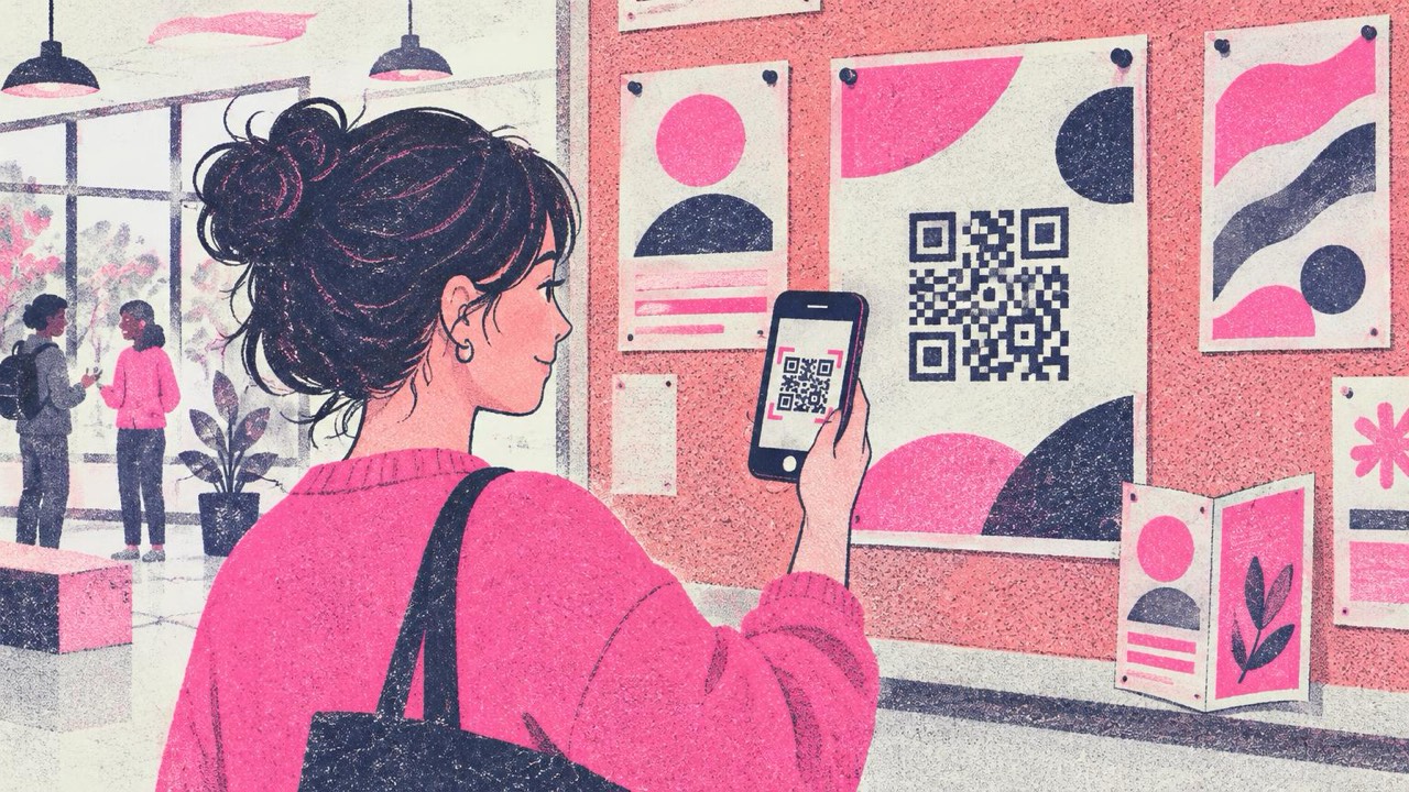
You have one A5 flyer to explain a course, a menu, a product or an event. There is room for a headline, a picture and three lines of text. Everything else, the full timetable, the prices, the demo video, the booking form, does not fit. A QR code is the bridge: the paper makes people interested, the code takes them to the rest.
That only works if people know what they will get, the code scans, and the page behind it still exists in six months.
What to link to
Pick the one thing a reader of this piece of paper most likely wants next. Good targets:
- The full PDF: the complete brochure, catalogue or programme, for people who want every detail.
- A price list: so the flyer does not go out of date when prices change.
- A video demo: a product in use, a venue tour, a recipe. Much easier to show than to describe on paper.
- A sign-up or booking form: for courses, events, free trials, newsletters.
- A menu: on a takeaway leaflet or a poster outside a café.
- A manual or setup guide: on packaging inserts and product labels, so the box can carry a one-page quick start.
One code, one destination. If you are tempted to add a second code, ask which one matters more and put the other link on that page.
Make the code in the main generator: paste the address, pick a style, download.
Point it at a page you control
A printed QR code cannot be changed. The code contains the address itself, so whatever you link to on the day you print is what every copy will open for as long as the paper exists. That is also why the codes from this site never expire: there is no redirect in between that can be switched off.
The catch is on your side. If you link straight to a file on a shared drive, a form you later delete, or a video you later replace, every printed flyer leads to an error page.
So link to a page you control and can update:
- a page on your own website, such as
yoursite.com/spring-course, rather than a long file-sharing link - a page you keep alive after the campaign, even if it later just says the event is over and points to the next one
- a short, clean address, which also makes a simpler code that scans more easily
When the price list changes, you upload a new one to that page. The flyers in the world keep working.
What to write next to the code
A bare square on a poster asks people to scan without saying why. Most will not. Put a short line next to the code that tells them exactly what they get:
- “Full price list”
- “Watch the 2-minute demo”
- “Book your place”
- “Download the full programme (PDF)”
- “Menu and opening hours”
Be specific. “Scan for more info” is weaker than naming the thing. If the link opens a large PDF or a video, saying so helps people decide whether to scan on mobile data.
For codes you print yourself, the generator has a Frame option that adds a label around the code. For designed materials, put the text in your layout right next to the code, close enough that the two read as one unit.
Size by medium
The rule from the print guide: the code should be at least one tenth of the distance it will be scanned from, and never smaller than 2 cm (0.8 in). Longer links make denser codes, so go bigger for them.
| Where | Code width |
|---|---|
| Flyer or product label | 3–4 cm (1.2–1.6 in) |
| Brochure page or manual | 3–4 cm (1.2–1.6 in) |
| A4 or Letter poster | 10–15 cm (4–6 in) |
| Shop window, seen from 2–3 m | 20–30 cm (8–12 in) |
Think about where people stand. A poster on a notice board is read from a metre away; one across a corridor or behind a counter needs a bigger code. The print guide has a calculator for the exact distance.
Placement matters as much as size. Keep the code away from folds and the binding of a brochure, off the edge where it might be trimmed, and at a height people can reach with a phone on posters. Leave a light margin around it at least as wide as four of its small squares.
Print it so it scans
- Download SVG for the print shop. It stays sharp at any size. If you must use PNG, use at least 2048 px for posters.
- Dark code on a light background. Brand colours are fine if they are dark enough; pastel or inverted codes fail on many phones. The generator checks each design as you edit and warns you about low contrast.
- Matte beats glossy. Glossy paper and laminate reflect light under shop lamps and can hide part of the code.
- Logo only if small. Adding one switches on High error correction, but a large logo still makes the code harder to read.
Test before the print run
Print one copy at actual size on the real paper, or ask for a proof. Then:
- Scan it with two or three different phones, including an older one.
- Scan from the real distance and in the real light, not at your desk.
- Check that the page opens properly on mobile and loads fast.
- Check that it is the right page, not a draft or a staging link.
Five minutes of testing is cheaper than reprinting a thousand flyers.
Checklist
- One destination per code: PDF, price list, video, form, menu or manual
- Link points to a page you control and will keep online
- A short line next to the code saying what people get
- Size from the print guide, never under 2 cm, with a light margin
- Away from folds, trims and hard-to-reach spots
- SVG file, dark on light, matte paper
- One printed proof scanned with several phones before printing the rest