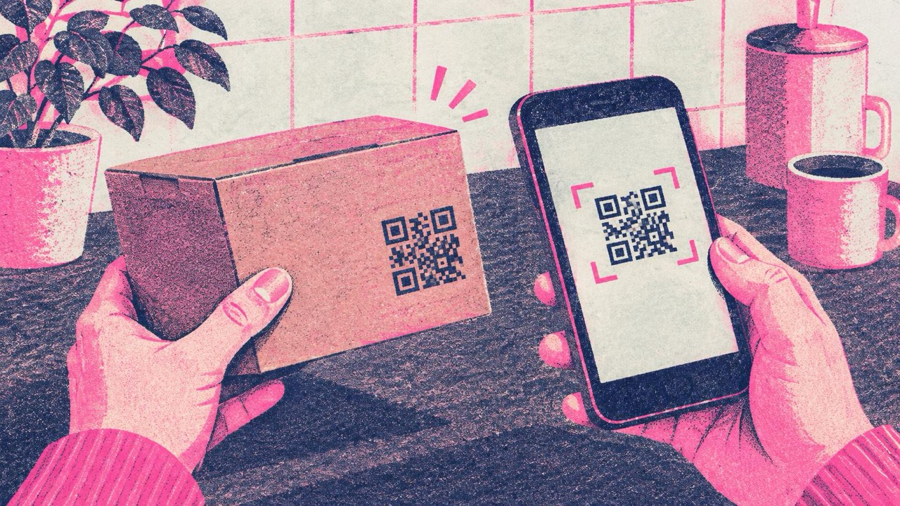
A customer opens your box at the kitchen table. The folded instruction sheet is already lost, the label is too small for the full ingredient list, and they want to know how to clean the thing before using it. A QR code on the packaging puts that answer one scan away, and it keeps working long after the leaflet has gone in the recycling.
What to put behind the code
Make the code on the main generator with the address of a web page. The page does the work; the code only opens it. Good targets:
- Manuals and assembly instructions. A page with steps and photos, or a short video. Easier to follow on a phone than a folded sheet in six languages.
- Care instructions. How to wash, store, descale or maintain the product.
- Recipes and serving ideas for food, drinks and kitchen products.
- Ingredients and allergen details. The full list, sourcing and nutrition, beyond what fits on the label. The required information must still be on the pack itself where the law says so; the code adds detail, it does not replace the label.
- Warranty registration. A short form with the model already selected.
- A review request. For a local shop or maker, the Google review QR code generator opens your review form directly.
- Reorder. The product page in your shop, so refills and spare parts are one scan away.
Use addresses you control
Packaging stays in homes for years, and you cannot change a printed code. Codes made here never expire, but the address inside them is fixed. So point each code at a page on your own site, such as yourbrand.com/p/kettle-manual, and keep that address alive. When the manual or the recipe changes, update the page. Do not link to a file on a shared drive or a shop listing that might disappear.
Short addresses also make simpler codes, which matters on small labels.
One code per purpose, with a label
A box with three unlabelled codes leaves the customer guessing. A box with one code that opens a menu of ten links makes them search. The best approach sits between:
- One code per job. If you want a manual and a reorder link, use two codes, or one code that opens a product page where both are the first things on screen.
- A label next to every code. “Assembly video”, “Full ingredients”, “Reorder”. Two or three words tell people why to scan.
- Put it where the need is. Assembly instructions on the inside of the lid or on the flap the customer opens first. Reorder on the bottom or back, where people look when the product runs out.
The generator’s frame option can add a short caption under the code, so the label is part of the artwork.
Size on small labels
The print guide rule: make the code at least one tenth of the scanning distance, and never smaller than 2 cm. People scan packaging from 20–30 cm, so:
- Small labels (jars, cosmetics, tags): 2–2.5 cm is the minimum. Do not go below 2 cm.
- Boxes and pouches: 2.5–4 cm.
- Shipping boxes and outer cartons: larger is fine, 5 cm or more.
A longer address makes a denser code. If the code must be small, use a short address and leave out tracking parameters. Every design is checked with your browser’s own reader as you edit, and the preview warns you when a style or logo makes the code hard to read. At 2 cm, skip the logo and keep plain square modules.
Curved surfaces, kraft and coloured stock
Curved surfaces
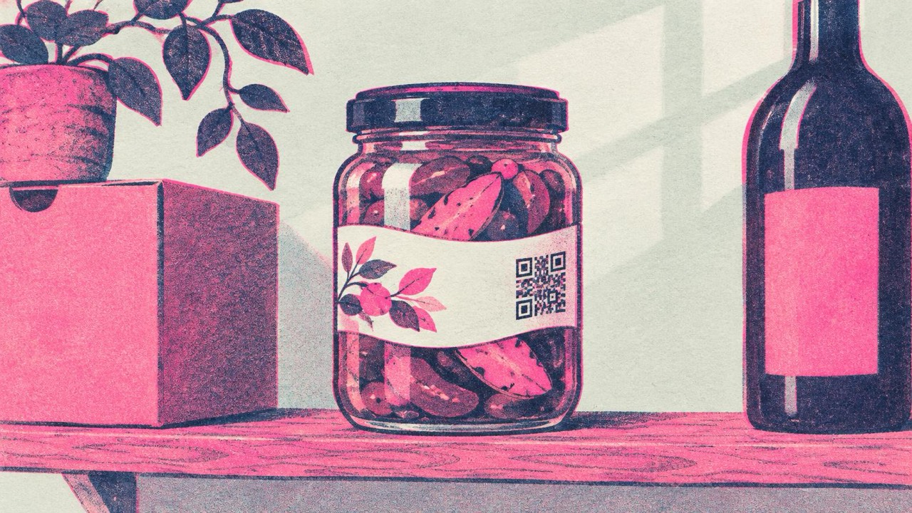
On a bottle, jar or tube, the code bends away from the camera. Place it so it runs along the height of the container, not around it, and keep it small relative to the curve. As a rough guide, a code that wraps less than a sixth of the way round still reads flat enough. Test on the real container, not on a flat proof.
Kraft and coloured stock
Brown kraft paper and coloured board lower the contrast. QR codes need dark modules on a light background:
- Print a white box behind the code on kraft or dark stock. That one change fixes most problems.
- Use a dark ink, black or deep navy. Avoid light colours, and avoid inverted (light-on-dark) codes.
- Watch for ink spread on uncoated and textured paper. Small squares can bleed together; go a few millimetres larger than you would on coated stock.
- Matte finishes over gloss. Glossy film reflects shop and kitchen lights.
Quiet zone
Leave the white margin around the code, about four modules wide. Designers often trim it to fit a tight layout, or run a pattern right up to the edge. That is the most common reason printed codes fail. Download SVG for print so edges stay sharp at any size, and send it to your printer as vector artwork.
Mistakes to avoid
- Linking to a page you will delete when the product line changes. Old stock stays on shelves and in homes.
- A code with no label. People do not scan mystery squares.
- Placing it over a fold, seam or crimp. Folds break the pattern.
- Approving from a screen proof. Get a printed sample on the real material and scan it with several phones.
- Pages that are not built for phones. A desktop PDF manual defeats the point.
Checklist
- Each code points to a page at an address you control
- One purpose per code, with a two- or three-word label
- Mandatory label information still printed on the pack
- At least 2 cm wide, larger on boxes
- White background box on kraft or coloured stock, dark ink
- Quiet zone kept, SVG sent to the printer
- Not on a fold or tight curve
- Printed sample tested on the real packaging